As part of the process of developing a new Drupal 8 Careers Wales website utilising the Welsh Government’s global experience language (GEL 2), the client wanted us to create a digital style guide that would help them keep consistency for this and future projects. This component library was required to be platform agnostic, not just built for the requirements of Drupal, meaning that the organisation wouldn’t be tied to any particular platform in the future.
The interface inventory
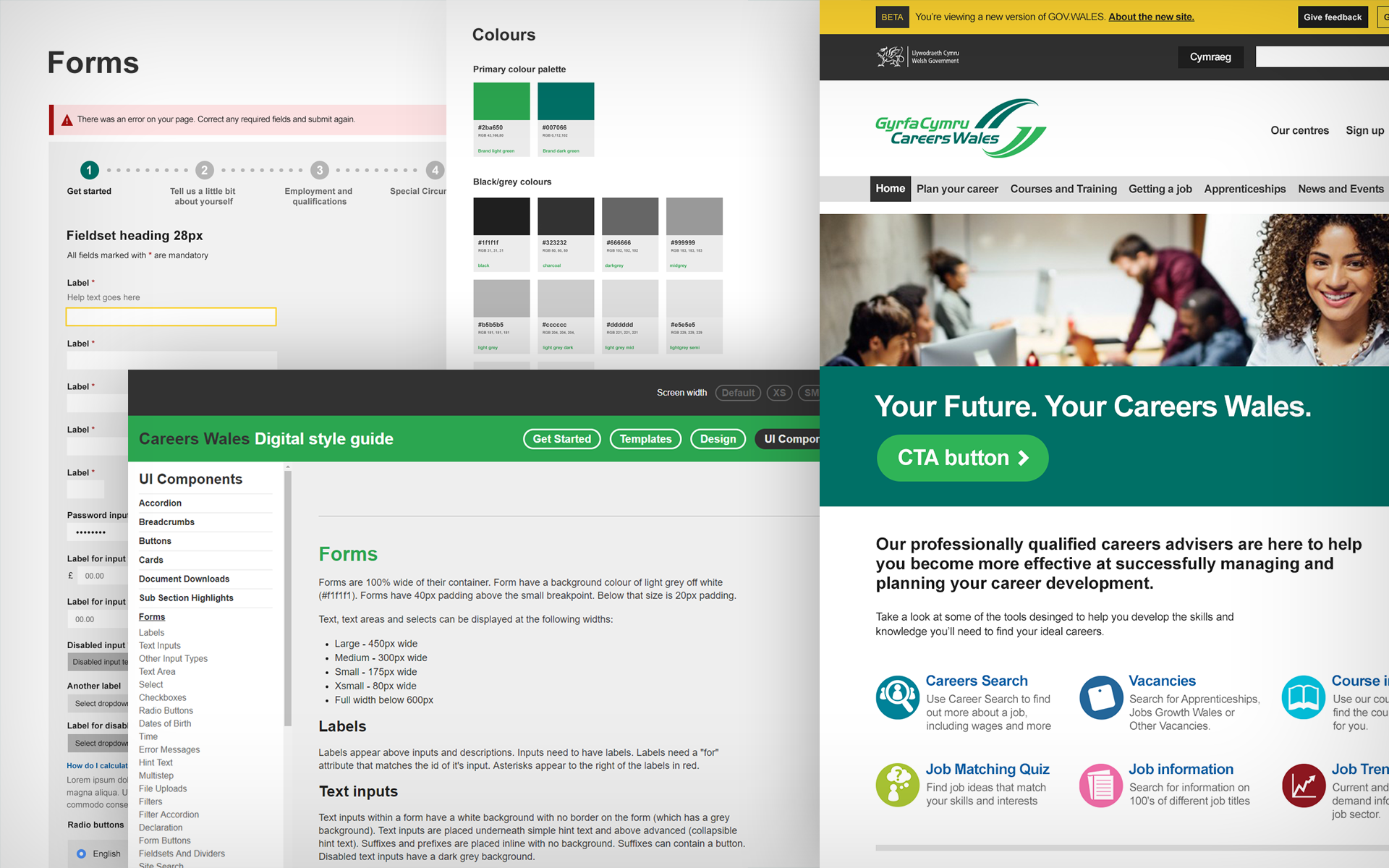
The process involved initially creating an interface inventory of the required components. The components needed to cover designs we had already created for the new site, as well as anticipating content that may be migrated from their existing site.
Each component was listed and given a unique name. The key consideration at this point was to get the right balance between making components flexible enough to cover a range of content scenarios, whilst not overwhelming the content editors with too many options in the back end of a content management system.
Component design
Once the client has agreed the list of the components, we began designing each component from the interface inventory. The initial design process involved researching and documenting reference points for each component. The design process was informed by the existing component designs from the Welsh Government’s GEL 2 Toolkit. This document contained specifications for the core components from the GEL 2 framework. For required components that were not in the Toolkit, there were example websites to reference or new components were designed that visually aligned.
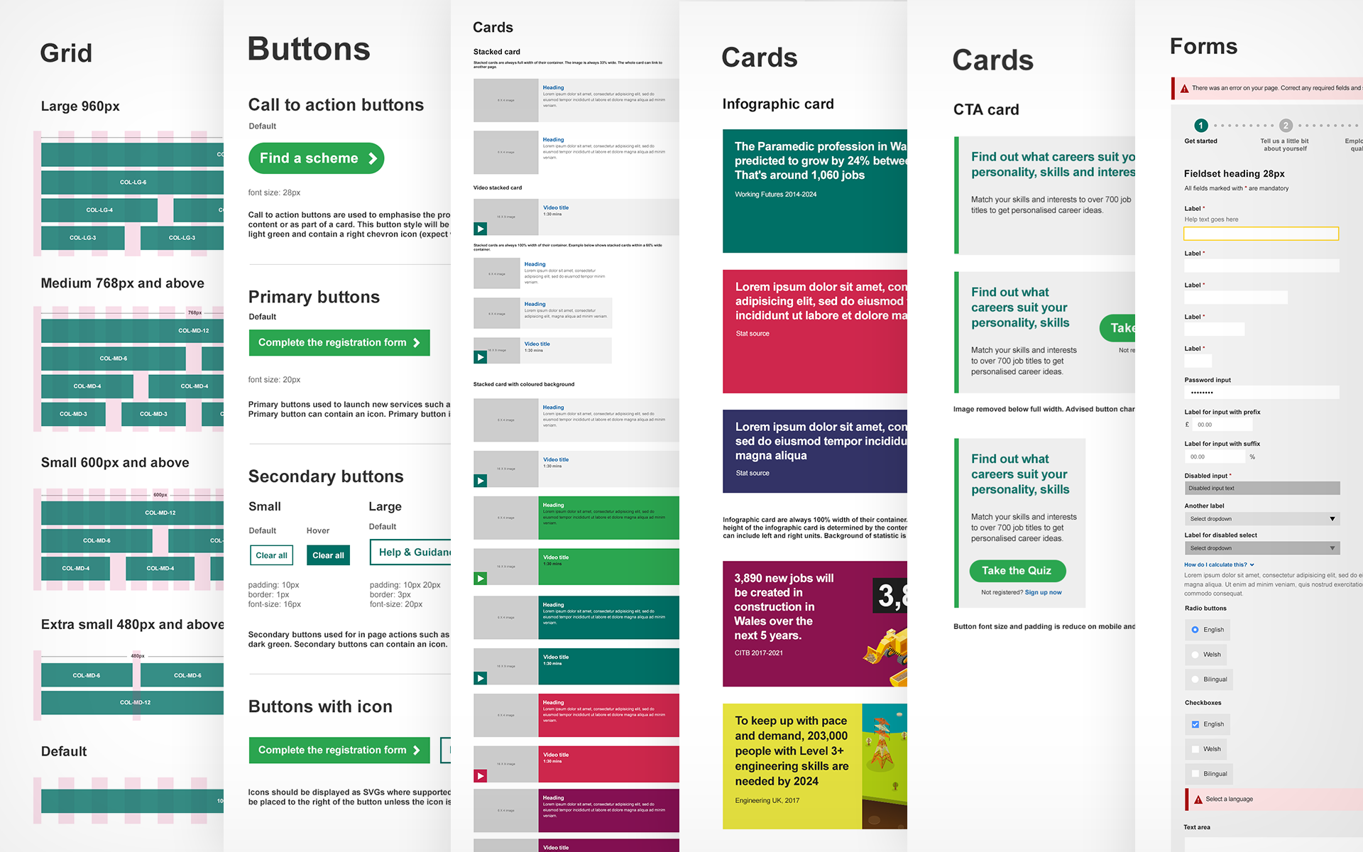
It was important that components were designed in the correct order, starting with the core components including grids, colours and typography. The more bespoke components, then inherited these styles.
The design process had to consider the display at various screen widths. These were based on pre-defined breakpoints that were set out within the GEL 2 documentation.
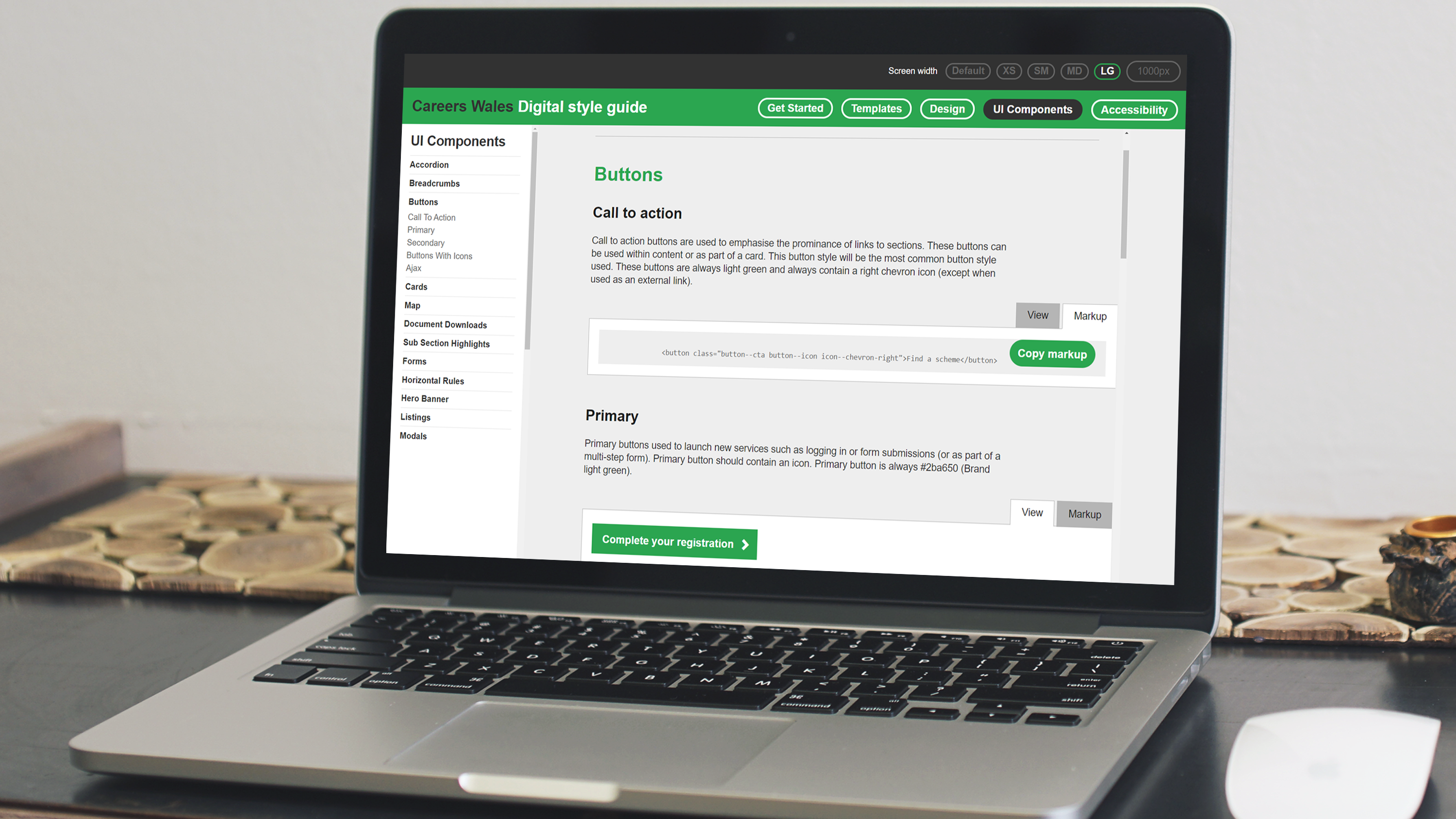
Once all the components were signed off, we designed a container for them. This allows the user to quickly find components, understand the context they should be used in and implement them as the html and CSS can easily be viewed on a component basis.
Building the components
Our initial development task was to build the container for the components. The container needed the ability to present the content in a clearly structured way where components were grouped into various types. Each component needed to be displayed showing the mark up and CSS. The container was also built to allow the user to view each component quickly at various widths.
Each component then had to be built to the exact specifications set out in the designs. The core components were built first, subsequent components then inherited those styles. The mark up and styles of the components were built in a way that they either align or improve on existing GEL 2 websites with better validity and enhanced accessibility standards.
The output of the style guide was a single style sheet and JavaScript file that could then be utilised by future services.
Content
The final step of the style guide was to write content for each component, so the end users understand the context of how and where the components are intended to be used. Once each component was signed off, S8080 wrote supporting text. This was created with the different types of end users in mind, technical notes were added for developers, alongside notes regarding use of components that would be useful to designers and content teams. Once this content was created, it was presented in the style guide alongside each component.
As a result of creating the style guide, the Drupal 8 site build needed minimal frontend input and achieved a high level of consistency. The client also then had a living style guide that could be utilised for future services and added to over time.

