In this post I wanted to talk about the user’s needs and general rules of thumb for navigation or pathway pages…
So what’s a navigation page?
Navigation pages are the pages between the home page and the information pages. The aim of navigation pages is to get the user quickly to the information they are looking for. Most site visitors are on a hunt – they have a goal or task and the navigation page is THE way to get them there quickly (by increasing the scent of information and giving clear links as next steps).
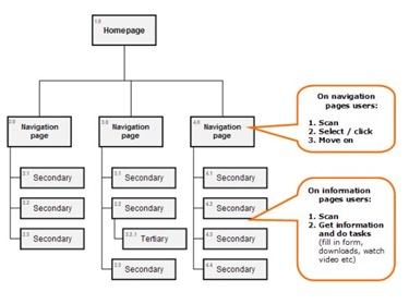
Above: Navigation pages – where they sit in the site hierarchy
From our observations, and other research, people don’t want to read a lot when they are ‘hunting / foraging’ for information. Only when the user has reached the page which screams ‘here’s the information you are looking for’ does the user suddenly turn from information hunting to gathering, they are now ready to feast, read – and devour information!
Some rules of thumb for navigation pages:
- Navigation pages are really table of contents – they give a quick overview of what’s offered and show the user where to go next
- Cut the text – most users won’t read even a paragraph of text on a navigation page, the page needs to tell them what to click on / do without reading
- Links with a short one line of text which includes trigger words / keywords helps
- Images can help too – make sure they add to the users understanding of what is behind the link and are not just ‘eye candy’
- Bullet points work really well
- Marketing messages and copy will be ignored – on navigation pages just make sure user can find the information they are hunting for quickly
- Don’t panic about the “3 click rule” (or rather “3 click myth”), observing users has taught us they are happy to go beyond 3 clicks if these are quick clicks and the information scent is getting stronger
- Don’t make people think on navigation pages – use simple language, bullet points, big obvious links to all speed up navigation
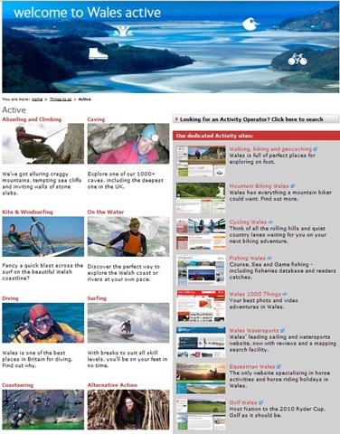
An example of a navigation page we designed for visitwales.co.uk – the aim for users to be able to move to the information they need VERY quickly
Directgov (www.direct.gov.uk) has lots of really good navigation pages, here’s one for Motoring:
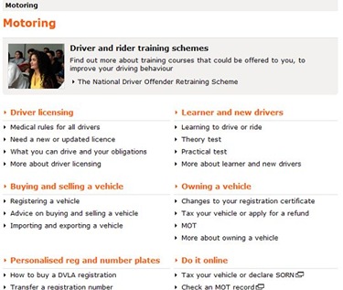
Lots of quick links and bullet points making a highly scannable and therefore quick navigation page.
Of course on many bigger sites we have a couple of layers of navigation page, as long as the information scent gets stronger as the user clicks through these they are fast links and get the user to their destination really quickly.
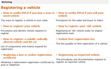
From the motoring page on DirectGov site clicking on “registering a vehicle” takes the user to another navigation page which then goes to the full information page
What about users landing inside the site?
Many users will land directly in your site, maybe on a navigation page so that’s why its important that navigation pages include:
- Site logo, name
- Strapline (make the logo a link to the home page)
- Global navigation device
- Home link
- Site search box if there is one on the site
- Footer and utility navigation devices
Finally users aren’t perfect!
On navigation pages we see uses clicking / choosing the first option that looks like it fits the bill. Therefore when organising the navigation page make sure:
- the ordering of lists and priorities on the page are carefully considered
- the most important information and links are high up the page
- if you want to persuade users to click one link over another put the priority link above the other one
Once you’ve built the navigation pages test them with users against tasks and goals. For more information on writing for the web this book is great: ‘Letting go of the words – writing for the web’ by Janice (Ginny) Redish

